How to Photograph Hamburgers That Actually Sell
Hamburgers are one of the hardest foods to photograph well. I mean, once you understand the basics around lighting, surfaces, backgrounds, and camera placement, the photography itself isn’t that hard–but burgers can still be surprisingly tricky. If I’m honest, the photography part isn’t the “hard” part. The styling is where the burger either becomes a hero, or just another sandwich that no one notices. So what is it that makes burgers tough to photograph?
The burger patty itself can dry out fairly quickly. They might not “stay” how you position them. They have pockets and protrusions that either look like black holes, or get illuminated too brightly. Depending on your lighting, they can look flat, greasy, or lifeless if you don’t understand how to manage shape, moisture, and shadow.
But when styled, lit, and photographed well, burgers become one of the most powerful visual assets a restaurant can have. They communicate portion size, freshness, indulgence, and quality in a single glance. And, they strongly influence ordering behavior.
In this article, I’ll break down two burger lighting setups that reliably produce clean, professional, high-conversion food photos; even in a small home studio.
the two burger styles that sell
Most successful burger photography falls into one of two categories:
|
Style |
Best For |
|
Bright Menu Style (on white) |
Delivery apps, menus, POS boards, websites |
|
Dark/Moody Pub Style |
Branding, social media, promotional imagery |
You don’t need an expensive studio in which to produce the images either. But you do need to understand how light direction, shadow control, and background choice shape the perception of the food.
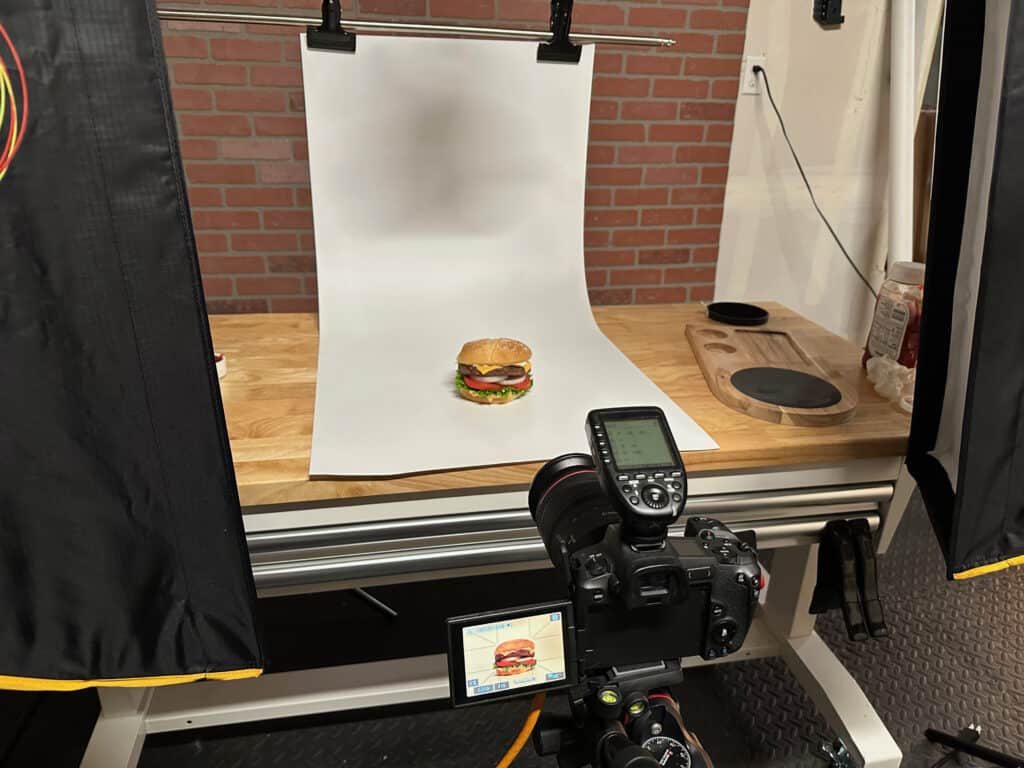
style 1: bright menu burger photography
This is the clean, high-clarity look you might see on DoorDash, UberEats, or in-store menus.
The Goal:
Maximum clarity, honest color, and visual “freshness.”
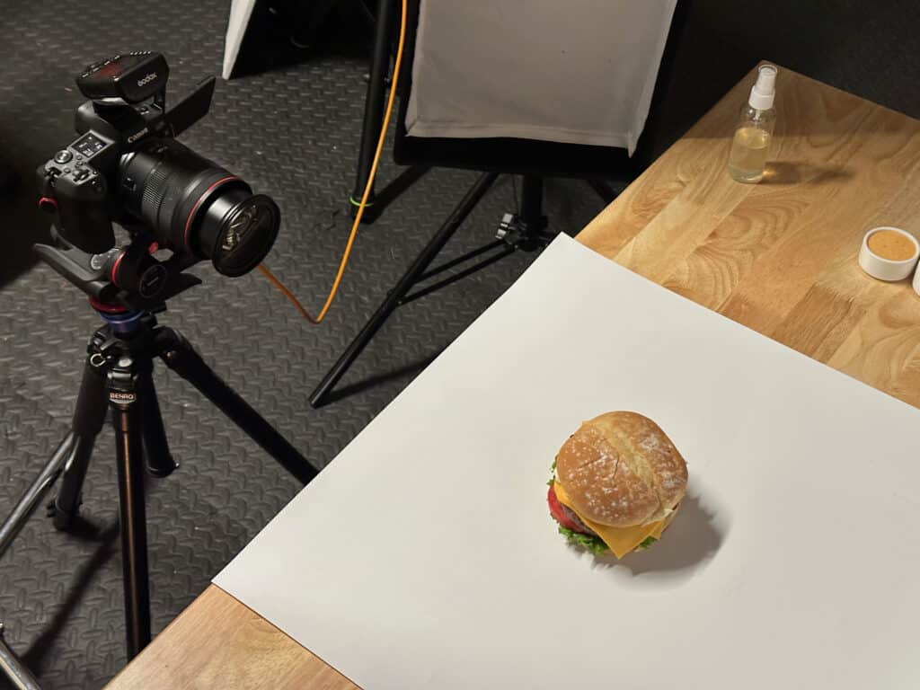
What makes this style work
|
Principle |
Why It Matters |
|
Broad, soft light |
Prevents harsh shadows and greasy highlights |
|
Neutral (white) background |
Keeps attention on the food |
|
Front-biased lighting |
Makes toppings/ingredients easy to see |
|
Controlled shadow |
Adds dimension without darkening |
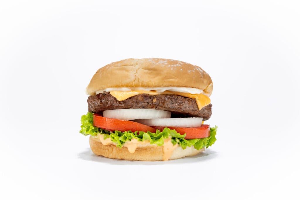
This lighting style emphasizes accuracy and appetite clarity, which is exactly what customers want when choosing food online. This is the look that performs best for:
- delivery apps
- menu boards
- online ordering
- restaurant websites
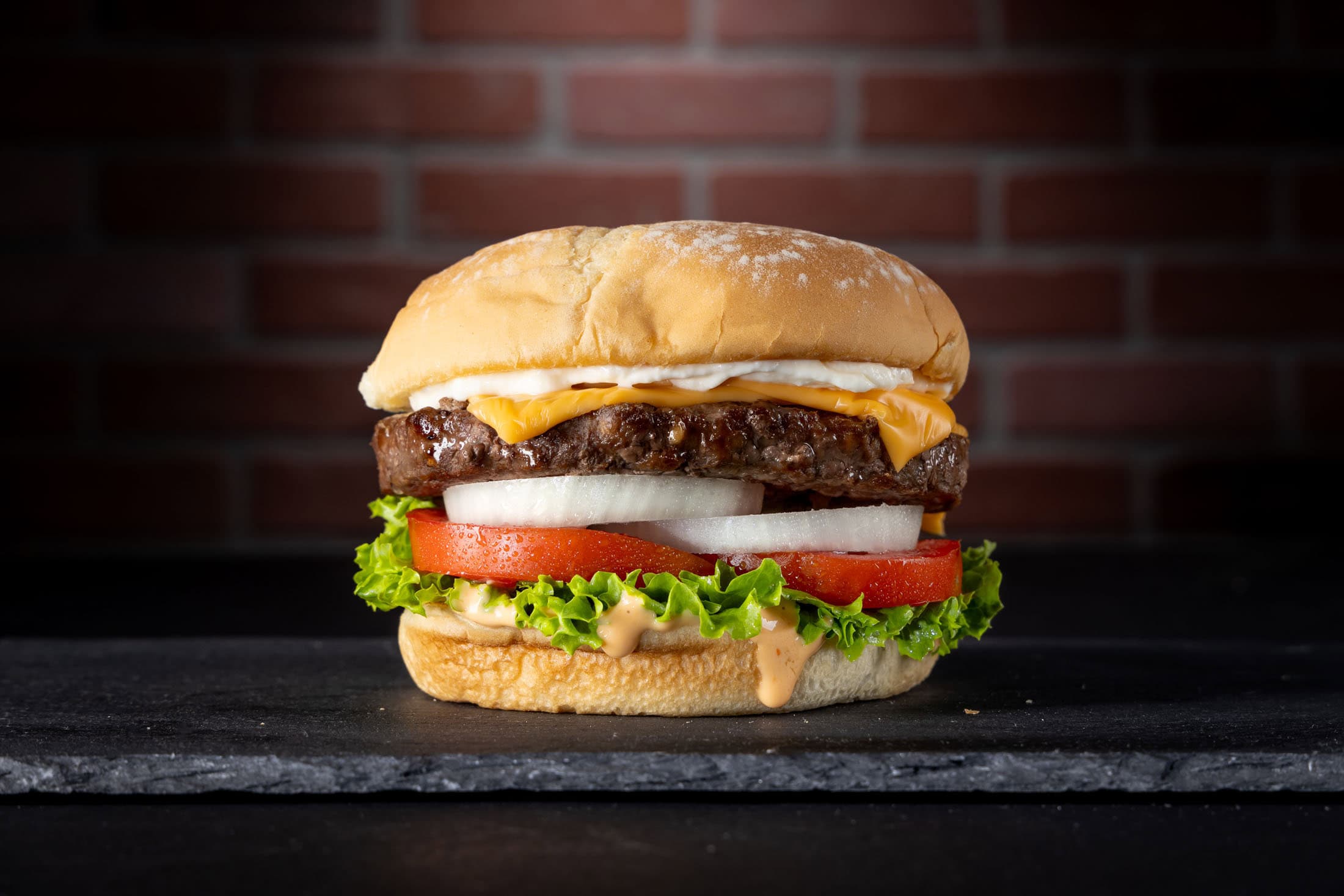
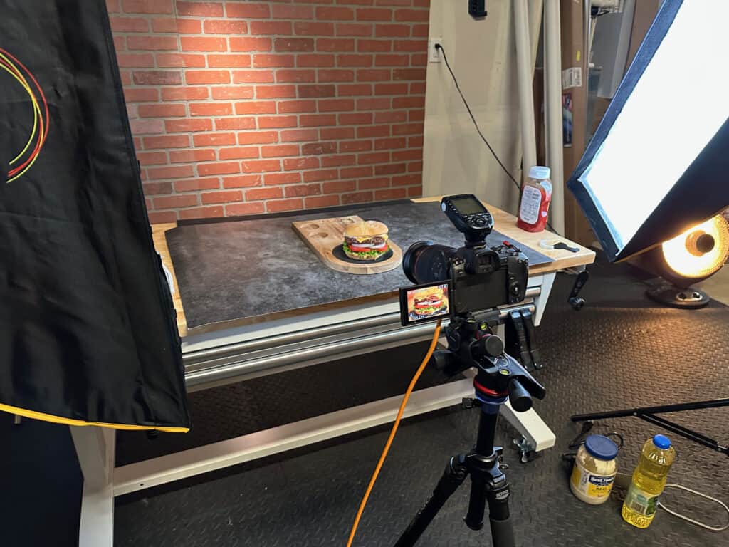
Style 2: Dark Pub Burger Photography
This is the more moody, dramatic style used for branding and promotions.
The Goal:
Create depth, richness, and indulgence. The viewer can almost “feel” like what it’s like to be in the pub.
What Makes The Pub Style Work
Instead of a neutral surface and background, we deliberately use darker surfaces and backgrounds to create an ambience of being in a pub. We keep the burger lit such that we still see all the freshness and ingredients. Optionally, you can experiment with side lighting the burger, so it partially falls off into shadow. It all depends on the “look” you’re going for. Generally though, we want to use:
- deeper shadows
- textured backgrounds
- warm color contrast
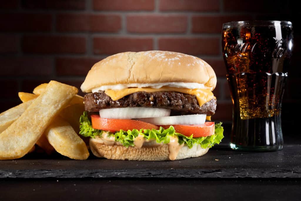
This style visually communicates:
- richness
- comfort
- indulgence
- premium positioning
This type of darker image is especially effective for social media, website hero banners, print ads, and restaurant branding.
Why light direction matters more than Camera gear
You could have a $6000 camera and lens combo, but your burger photos might not look that great if the light comes from the wrong angle. If you light from overhead, you might see the top bun nicely, but the ingredients might fall into shadow, making the burger look unappetizing. If you light from the front, you’ll see everything clearly, but then you might lose some of the three-dimensionality the burger has. If you use a hard light, you run the risk of specular highlights on grease, which can either make the burger look juicy and delicious, or a greasy heart attack on a bun–depending on just how much grease is present.
What we want is for the lighting to balance:
- the vertical height of the burger
- edge definition
- controlled shadow and light falloff
- purposeful highlight placement
Controlling the light helps give the burger its three dimensional shape, an appetizing look, and a delicious presence.
What these two styles have in common
Even though the finished images look very different, both styles rely on the same fundamentals. I mean, if you look closely, you’ll see the burger I photographed for these examples is the exact same burger–just in two different scenes. So what do we need to keep in mind–no matter the image style we need to produce?
|
Fundamental |
Why It Matters |
|
Structurally support the burger |
So it doesn’t fall apart or collapse |
|
Control moisture |
Prevents dried out patty, and makes toppings look fresh |
|
Shape reinforcement |
Maintains height |
|
Control light and shadow |
Adds three dimensionality and depth |
|
Background separation |
Prevents visual clutter and makes the burger the star of the show |

These are basic, core principles behind professional food photography, not some “tricks” that people use.
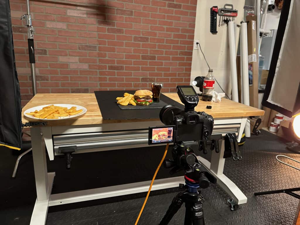
You Can Do this in a home studio
All of the images in this article were produced in a small home garage studio, using compact lights, simple modifiers, and controlled light direction. You don’t need a commercial kitchen, restaurant, or rental studio to produce professional-grade burger photography.
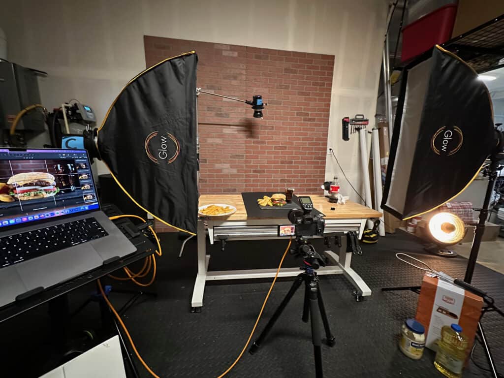
What you do need is an understanding of:
- where the light should fall
- where shadow should live
- how to protect texture
- how to control contrast
Final Thought
Good burger photography isn’t about complicated food styling tricks. It’s about lighting decisions. When light is placed correctly, burgers naturally look taller, fresher, juicier, and more indulgent–even before any advanced styling techniques are applied.
And that is exactly what drives clicks, orders, and sales.