How I Created This Dramatic Drink Splash Photo (At Home in a Tiny Garage Studio)

Step-by-step lighting breakdown, behind-the-scenes setup, and the exact tools that made this product splash photography photo possible.

Most people see a product splash photo like this and assume it was created in a full commercial studio with thousands of dollars in specialty equipment.
Nope.
This entire shot was done in my garage — with gear you can absolutely replicate and techniques anyone can learn.
This tutorial breaks down everything:
- The concept
- The lighting strategy
- How I created the “window blinds” shadow pattern
- How I froze the splash
- The biggest mistakes to avoid
- And how to adapt this technique for your own brand photoshoots
So grab a coffee, sit back, and let’s walk through it.
1. The Concept: Hard Light Meets Controlled Chaos
The goal of this shot was simple:
Create a dramatic, refreshing, almost cinematic look using nothing but light.
I wanted:
- A crisp, icy splash
- A backlit glass silhouette
- Strong directional shadows
- A stylized “late afternoon sunlight through blinds” effect on the background
That meant two things:
(1) I needed hard light
(2) I needed precise control
Hard light gives you:
- Sharp shadows
- Defined textures
- Crisp highlights
- Beautiful splash definition
But hard light is also unforgiving, so controlling spill and keeping the background clean was crucial.
Here’s a simplified top-down view of how everything was positioned:

2. The Key Ingredient: A Projection Attachment With a “Window Blind” Gobo
This shot simply wouldn’t work without one key tool:
A gobo projector (a.k.a. the projection attachment)
Inside it, I used a “window blinds” gobo, to throw that distinctive horizontal line pattern onto the background.

This creates two extremely important effects:
- A stylized environment (it looks like real sunlight through blinds)
- A bright element behind the bottle, which instantly draws attention
Without this element, the shot falls completely flat.
3. Lighting Setup Overview
This setup used three lights:

Light #1 — Background Projection (The Star of the Show)
Type: Strobe + projection attachment
Role: Creates the blinds pattern and the glowing background gradient
Placement: Just behind and slightly above the camera, aimed directly at the backdrop
Power: Moderate — just enough to make the pattern crisp
Why it matters:
This light establishes the entire mood of the shot. It’s the “hero light.”
Light #2 — Overhead Hard Light (Fake Sunlight)
Type: AD600Pro or similar
Modifier: Standard reflector with a DIY silver-card flag
Placement: High above the set, aimed downward
What it does:
- Backlights the glass
- Reveals texture in the splash
- Highlights the bottle edges
- Creates that “sunlight” vibe
The silver card taped to the reflector blocks light spill from hitting the background. I didn’t want to overpower the “blinds” projection.
Without spill control, the background turns into a washed-out mess.
Light #3 — Front-Fill Snoot (to light the bottle label)

Because the bottle was primarily backlit, the label ended up being too dark.
Solution:
A snoot aimed directly at the label.
This creates:
- A clean, bright label pop
- Zero unwanted light contamination
- A subtle, controlled glow
A snoot is essential here.
If you use a softbox or umbrella, you’ll destroy the crisp shadow aesthetics created by lights #1 and #2.
4. Freezing the Splash

The splash was created using:
- A clear glass
- Tap water
- An acrylic ice cube
- Back lighting
- Luck
- A remote shutter release
- More Luck
Camera settings (typical for this type of shot):
- Shutter: 1/200 (sync speed)
- Aperture: f/8
- ISO: Low as possible
- Flash duration: The real freeze mechanism
Key Takeaway:
Contrary to popular belief, shutter speed doesn’t freeze the action — flash duration does.
Short flash duration = frozen droplets.
Long flash duration = mushy blur.
(The AD300Pro and AD600Pro freeze water splashes very nicely.)
The Process:
I stood next to the table, just out of frame, and plopped the acrylic ice cube into the glass. As the cube hit the water, I clicked the shutter button on the remote shutter release. Most of the shots were captured too soon, or too late. But I did manage to get several “keepers.” Eventually, I got tired of wiping up the mess between shots, and settled on the splash capture I liked.
5. Composition & The Unique Glass
The surreal drama comes together because all the elements do their jobs:
- The tall, elegant bottle
- The twisted stem of the glass
- The splash itself
- The clean terrazzo surface
- The “window blinds”
The composition is boring until that explosive splash happens.
The “Z-stem” martini glass adds energy without being too gimmicky. It’s optional, but I think it adds life to the shot.
6. Post Processing in Lightroom
The first thing I did was import the images I captured into Lightroom. The first shot was the “calm before the storm”–just a glass of tap water sitting there next to the bottle. The next few shots were various splash attempts.


Here’s the unedited shot I decided to go with. I know it looks black-and-white at first, but it’s not. Notice the cork in the bottle, the subtle gold coloring in the label and the terrazzo surface with brown and orange flecks in it? The reason it looks black-and-white is because I shot against a white background with the window-blinds projection attachment. The only part of the background that is “white” is where the light from the attachment hit it. All other parts of the background appear as medium gray, because no light hit there.

Lightroom Mask: Color Range
This is the part where I added that blue/teal color to the image. In Lightroom, add a new mask, and select “Color Range” from the list of mask options. With a color range mask, you just move your mouse over the image, and your pointer turns into a color picker eyedropper thing. Just click the color you want to apply the mask to. In my case it was that medium gray background.

With the mask in place, all I had to do next was slide the “Temperature” slider to the left until the background turned a color of teal blue that I liked.
Lightroom Mask: Linear Gradient
If you look closely, you’ll see a second mask there in Lightroom. That’s just a linear gradient that covers the table. All I did with that mask was drop the highlights a little, and boost the temperature a smidge to preserve the yellows/oranges on the terrazzo tabletop.

Easy peasy.
6. What I’d Do Differently Next Time
Every good photographer reflects on their process. If I were to do this again:
- I’d capture more splashes, and combine them using layers in Photoshop
- I’d try different gobos in the projection attachment
- I’d test using a CPL (circular polarizer) to see if I could get different looks
This is how you evolve the look into a full series — ideal for commercial beverage work.

7. Want to Try This Shot Yourself? Here Are Some Key Takeaways
This shot might look complex, but every part is learnable and repeatable.
8. Gear Used to Create This Shot
 My Actual Gear List for This Shot
- Camera: Canon EOS R [Amazon] [Adorama (Used; All conditions)]
- Lens: Canon 24-105mm f/4 [Amazon] [Adorama]
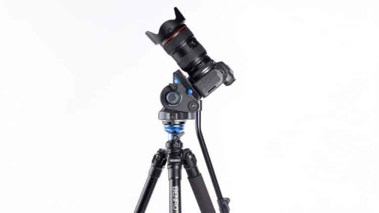
- Tripod: Benro A2573FS6PRO [Amazon] [Adorama]
- Tripod Head: Manfrotto 3-Way Geared Head [Amazon] [Adorama]
- Lighting: Godox AD600Pro (x1), Godox AD300 Pro II (x2)
- Accessories: Projection Attachment, Remote Shutter Release, Snoot, Surface
9. Final Thoughts
Shots like this remind me why I love product photography — it’s problem-solving wrapped in creativity.
You don’t need a massive studio. (I mean come on–look at my spectacularly messy garage!)
You don’t need agency clients.
You don’t need $10K worth of lights and modifiers.
You need:
- A vision
- A couple of lights
- A projection attachment
- And the willingness to experiment
If you try this setup or create something inspired by it, let us know in the comments!
I’d love to see what you create!